
The following is a guide on the Aperture sizes based on the area of reference. A crude drawing (drawn in Paint), but works to pass on the message..!!
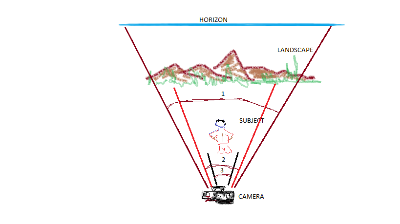
The above diagram displays three different areas in focus, Subject, Landscape and the Horizon. To denote the focal area for each I have given them a unique id 1-Horizon; 2-Landscape; 3-Subject. Refer the following table now.
| Unique Id | Aperture Size | What’s in Focus | f/stop |
| 1 | Smaller | Entire shot in focus | f/32 |
| 2 | Medium | Most shot in focus | f/11 |
| 3 | Largest | Subject in focus; everything else behind is blurred | f/4.0 or f/1.8 |
The following is a GRAPH (drawn in Visme, an infographic software), visually depicting how the Amount of Light changes when Aperture Size changes and how the Depth of Field (DoF) varies and how the Focus changes. Me being a visual guy, I understand such relativity better when shown in picture.
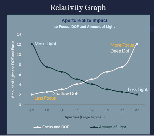
How to read the above graph:
The larger the aperture (f/1.4, f/1.8) – Less Focus and Shallow Depth of Field
The larger the aperture (f/1.4, f/1.8) – More light can come in
The smaller the aperture (f/22, f/32) – More focus and Deep Depth of Field
The smaller the aperture (f/22, f/32) – Less light can come in
Note: The numbers representing “Amount of Light” are just indicative to show an ascending growth. They are not scientific data. Probably if I research I can replace them with actual scientific unit of measurement called Candela (for curiosity sake,Candela is the standard SI unit for measuring the intensity of a light source for photography), but I won’t. I want to keep this as simple as possible for everyone to understand.
Readers, please let me know what you think about the visuals. Do they help?


Leave a comment